JVB
A NEW APPROACH…
I’ve been thinking about this quite a lot recently, about getting back to writing longer pieces and reinvigorating this outlet for some musings on a variety of topics that interest me and that rise through the background fuzz of daily life to demand a bit more attention…
In response to these thoughts and in an effort to keep things fresh, I’ve come up with a new approach on creating posts for this blog.
By setting myself some (and it has to be said, fairly arbitrary) limits within which to write, my intention is that all future posts will be shorter, more focused and consequently easier and quicker to read.
In the UK, the average reading speed is around 225 to 250 words per minute, so taking that as starting point, the new “JVB” subtitle to the original blog can be interpreted as follows:
The J & B reference back to the original JoeBlogs title.
The “V” represents “five” : maximum 5 minutes to read, maximum 500 words, 5 images, 5 paragraphs…
(It’s also a little play around on the more familiar JCB & JVC logos, which quite appeals…)

I did think about starting a new blog, making a fresh start, but that does seem rather a perverse move, as over the 13 years or so since I started writing, I’ve written much that I’m proud of and have created a significant body of work that has attracted a staggering number of visitors, comments and followers.
So, I’ve decided to keep the old blog and just carry on with this page of minor explanations as to the blogs future development…
So, let’s see how we get on shall we?…
William Mitchell
 It is with huge sadness that I have to write that my good friend William Mitchell is no longer with us, having passed away recently at his home in Cumbria.
Bill was a singularly creative and endlessly entertaining man who I was lucky enough to get to know through this very blog.
One of my very early posts from April 2011, followed a trip to Liverpool where I witnessed the wonders that are the doors to the Liverpool Metropolitan Cathedral. After posting my piece, I got a message from Bill thanking me for the kind words and asking if he could use my photo of one of the figures from the doors. I said of course, told him how I thrilled I was to hear from him and that I thought more people should know about his wonderful work.. A couple of Mitchell themed posts later, we met up and became friends.

I had the great privilege to help Bill and his lovely wife Joy with his autobiography William Mitchell – The Eyes Within…, taming the massive and unruly 400Mb+ Word document with embedded images they had been wrestling with for a number of years into a more manageable InDesign version with text and images formatted to resemble the book they had in mind… The photo Bill originally asked if he could use (to the right) became the inspiration for the book cover.
In the nine or so years I have known Bill, his work has quite rightly become more widely known and better appreciated. The photo at the head of this post is of Bill winning the 2014 Creativity in Concrete Award, and his work was featured heavily in the Out There : Post War Public Art exhibition at Somerset House in 2016. His enthusiasm, knowledge of and technical ability with, a staggering range of materials, resulted in an impressive variety of sculptures and murals that can still be found all over the world (despite a significant number of them having been lost due to demolition).
Bill Mitchell’s place in the lists of the great British artists of the Twentieth Century whilst not yet assured, is certainly looking more and more likely. Without doubt in my book, he has every right to be up there with the likes of Henry Moore, Lynn Chadwick, Eduardo Paolozzi and Anthony Caro, the only difference I can see is that Bill’s work adorned community spaces and community buildings rather than walls of art galleries.
Rest in Peace Bill, you will be missed.
A truly amazing image..
A photo from this weeks Guardian, has really captured my imagination.

It captures the time immediately after the partial eclipse seen across large parts of the US, as the sun moves out from behind the moon. There, clear as anything is the unmistakable silhouette of the International Space Station, on board of which are six human beings traveling at roughly five miles a second
The ISS orbits the Earth in an elliptical pattern anywhere between 370 and 460 kms above us, the moon can be anywhere between 360,000 and 400,000 kms away, and the sun is around 150 million km beyond that. Huge almost unimaginable distances, yet these three celestial objects sit together in this stunning composition as they are nearby neighbours.
I could look at this image and think about its implications in terms of human technological achievement and what the future of space exploration could hold for us for hours…
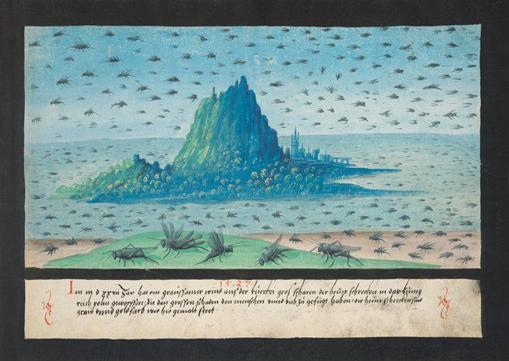
The Book of Miracles
The recently reformatted and republished Taschen version of “The Book of Miracles” is truly a wondrous thing.
A mirror to the hopes, beliefs and fears of the northern European Renaissance mind, it is a collection of nearly 170 mesmerising watercolour and gouache paintings, that illustrate through a fantastic combination of bold images and vivid colors, a cornucopia of long accepted visions, miracles and wonders from both biblical and secular life.
Astral happenings, dragons & multi-headed monsters, plagues and visitations, spectral apparitions, birth defects, messages from the heavens and other unfathomable acts of God, are all beautifully captured with imagination and skill.
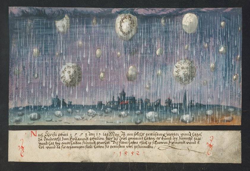
Commissioned, written and illustrated by wholly unknown sources, the book was originally produced as a folio of images and published in Augsburg, Southern Germany in the mid 1550’s.
How well it was received, how popular it became is not recorded, what is obvious however is that it effectively disappeared from history. That is until an almost intact copy of the manuscript came to light less than 10 years or so ago.
It is this amazing find, along with a handful of previously known pages that can now be seen as being obviously part of the original publication, that Taschen have used to create this latest edition.

The miracles depicted range chronologically from the early stories of the Old Testament and The Book of Revelations, right through to contemporary 16th Century Europe, with the spires and towers of Augsburg itself clearly playing a key part in setting the narrative.

Many of the miracles collected in the book are clearly based on earlier, popular and widely distributed woodblock illustrations by the likes of Albrecht Durer, Hans Holbein and Cranach the Elder, and it seems likely that whoever commissioned this amazing work, was looking to collect and document in a consistent and easily understood style, all the miracles that were known up to that time.

Although these images look undoubtedly dated through our 21st Century eyes (I used the word naive previously) they still have the power to inspire & intrique. I can’t help but wonder if the people that drew these monstrous and fantastical pictures, really believed in them fully. Did their overwhelming faith and fear of the Almighty drive them unquestioningly on, or was there a little voice in the back of their mind saying.. “hang on a sec, five suns in the sky at the same time? Really?..


Martian Surface Photos…
A new book This is Mars has just been published that collects together some of the most striking black and white images of the surface of Mars I’ve ever seen, none of which have previously been published.
These amazing pictures were taken by the Mars Reconnaissance Orbiter (MRO) which entered the Martian atmosphere in 2006 and which has since then, been quietly mapping the planet’s surface with its HiRISE telescope.

This one above and the one below particularly grab the attention as they seem to show landscapes that would be familiar here on Earth, such as trees in the snow and river deltas…

The large majorityseem very alien however, and I’ve genuinely no idea what kind of geomorphic or tectonic processes makes shapes and patterns like these below…


These stunning images add a completely new dimension to that of the dusty red planet that we’re more used to seeing from the Mars Rovers. I for one can’t wait until a manned mission to Mars is finally a reality and the world watches as the real life equivalent of Mark Watney and his crew, finally leaves Earth to visit our nearest neighbour.. (I just hope I’m around to share the experience…)


The Blue Pullman : How to design a train, the Bill Mitchell way…
A quick post to capture some thoughts on a fascinating conversation I had with my friends Bill & Joy Mitchell a week or so ago, and the barely believable story that Bill helped designed a train, and not just any old train. The famous Blue Pullman luxury train that set speed records between London & Manchester throughout the mid 1960’s and 70’s.
It all started apparently when Bill was approached by George Williams who at the time was the chief designer for British Rail. He asked if Bill would be interested in developing some full size mock ups for a 125mph train and a 250mph version. Bill decided that he was and after a fact finding trip up to Derby (the main fact uncovered being that there were hardly any drawings available to work from) set about finding a space big enough to make the mockups.

The answer was found in three sheds on the Woolwich Road where Bill and his team set about forming GRP into an engine unit and a carriage. He told me that the finished versions were in polished silver GRP and not blue, and that they looked very futuristic, shining like stainless steel bullets…
To get these huge things out of the studio once finished required the removal of an end wall to get them onto a lorry to take down to Marylebone Station, and it was at this point that Bill remembered someone had rung up the local police to tell them they’d been a train crash on the Woolwich Road, a story that apparently made the local papers..
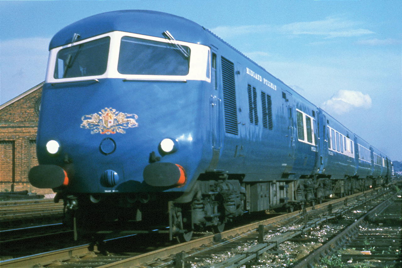
As well as the overall shape of the train, including the instantly recognisable twin windowed front nose, Bill told me he designed the round cornered windows (versions of which are still used to this day), the little table lights, the adjustable seats (“borrowed” from a Russian train) the galley kitchen, the overhead parcel racks (“borrowed” from a VC10) a non touch lavatory flush system and all the door ironmongery. He also designed the individual inlaid timber panels at the end of each carriage, one of which can just about be seen on the above video at about 13 seconds, and another at the top of the image below…

When I asked how as an artist, he had managed to interpret and ensure compliance with all the design briefs, H&S standards and rules that I assumed must surely play a part in designing something as serious and potentially lethal as a diesel-electric train, Bill just said “No, we didn’t bother with any of that business, they just wanted something that looked good and wanted it quickly…”
If only it were that simple today…
7 years, 500 Posts, 750 followers, 1000 comments, 750,000 visitors….
When I started this blog as something to keep me occupied until I found another job after our life affirming round the world trip, I could never have realised just how important it would become to me.
This post is my 500th since April 2010. In the intervening seven years of writing about all kinds of weird and wonderful things, my site has been visited more than three quarters of a million times and well over 1000 people have taken the time to respond to my ideas. I’ve met some really wonderful people from all over the country, people I now consider to be good friends and who I would never have met if I hadn’t picked up my digital pen…
Through writing this blog, I’ve also learnt so much, researching sometimes tangential subject areas to better assess what it is I’m trying to say. I’ve also been lucky enough to have had my work published in “proper” hard copy magazines which, along with requests to use my drawings and ideas for research projects and in other articles, has given me immense satisfaction.
All of which is really quite remarkable and very humbling. Although my post rate has fallen over the last few years and my target of five posts a month has been well and truly missed many times, the need to write about things that interest me is always there and whether anyone reads my words or not, has never really been the point anyway.
So a huge thank you to everyone who has taken the time to visit, comment, share and like. It’s all very much appreciated.
Not sure where the UK will be in another seven years time, still dealing with the monumentally stupid decision to leave the EU I suspect, and I can’t even begin to think about how old I’ll be then. But I think I can be confident in saying that the arts, architecture, music and culture in general will all still be going strong, creating pleasure, annoyance and confusion in equal measure as they always have done.
So presumably there will still be lots for me to write about in 2024, not least of which will be the Olympics, que some gratuitous graphics and shameless Olympic related JoeBlogs post links, link 2, link 3…). I hope you can join me along the way…

PS.… I’ve just realised that if you divide the 500 posts across the 84 months that make up 7 years, the average per month is very nearly 6 posts… So I am still on target, which is nice…
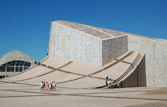
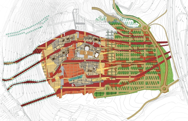
City of Culture of Galicia, Spain : Peter Eisenman
We went on an office trip to Berlin at the end of last year and I was talking recently to one of my work colleagues Ian, about the Memorial to the Murdered Jews of Europe by the American architect Peter Eisenman. I said I hadn’t read much about Eisenman’s work over the last few year’s and wondered how these big name architects survived on small projects…
Ian looked at me a bit funny, said what? and told me to look into Galicia’s City of Culture, a development on a scale so massive, that it could quite possibly be one of the largest building projects in Europe, that no one’s ever heard of… Which I suspect is something of an ongoing disappointment to the Citizens of Santiago de Compostella as they’ve had to watch as an unbelievably large number of Euros has been spent/ wasted trying to get it finished…

The complex is effectively a brand new city carved out of the top of a mountain in Southern Spain. Covering a total area of nearly 175 hectares, the project was to be a new home for a series of distinct cultural functions including a museum, a library, an archive facility, an arts center and a performing arts center.
The result of a 1999 competition, Eisenman’s winning idea was that the complex would appear as if it had always been there, buried below the surface, which though some unavoidable tectonic process, had erupted and heaved itself up from out of the ground.
Formally the layout was generated by overlaying part of the medieval street pattern of Santiago on to the top of the hill, which with the addition of some de rigueur Eisenman grid and fragmentation devices, helped to create an interesting, if somewhat rather spurious design concept.

The fiendishly complex nature of the proposals and the architects infamous penchant for minutely detailing every junction, resulted in a massive overspend, which with a final total cost in the region of €400m was more than 4 times the original budget.
Couple this with what now appears to be insanely over optimistic attendance figures (visitors to the beautiful UNESCO listed World Heritage site of Santiago, just do NOT seem to want to leave the Old Town) and what’s left is an empty folly to the vanity of its main protagonist, the premier at the time Manuel Fragan. A hubristic white elephant, or as The Guardian put it in a review when it first opened in 2011 “an anachronism at a time of austerity“.
So it came as no surprise to anyone when in 2013, after more than 10 years of building, and with Spain’s economic engine on the verge of collapse, that the project was permanently halted, leaving two of the six buildings unbuilt, and the future of the completed four, hanging precariously in the balance…. A perfect example of the wrong project in the wrong place at the wrong time..
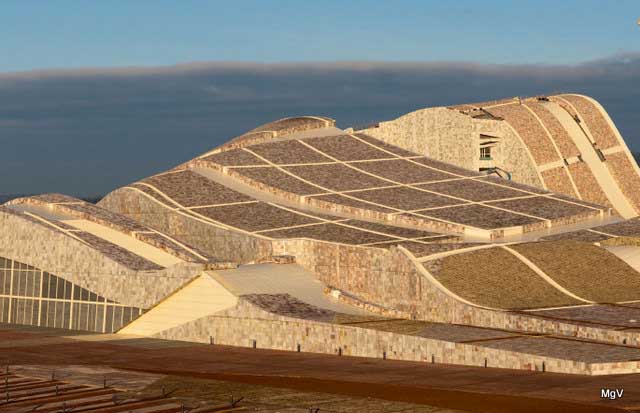
I usually like to finish with an opinion, but for this post, I think I’m going to let these images speak for themselves… The scope and ideas behind this project are undoubtedly interesting, the materials are wonderful and the spaces created dynamic and exciting. But at the same time the scale over which all these aspects are being spread really should have set alarm bells ringing.
Yes as architects we need to push the envelope, offer clients more than they knew or thought they wanted, but we do ourselves no favors as a profession when things get as out of hand as they seem to have done here… When you read that almost every slab of the stone cladding and paving is unique in size and shape and had to be computer cut to ensure that it went into the one place on the whole project it could, you really do have to question whether the clients best interests where ever really taken seriously…


Congress House : An Overlooked Modernist Masterpiece…
 Without doubt one London’s finest modern sculptural masterpieces is perversely, also one of the most difficult to find, hidden away as it is in a beautiful green mosaic tiled (originally Carrera marble) and glass enclosed courtyard at the heart of one of London’s least known modern architectural gems.
The sculpture is easily one of Jacob Epstein’s most powerful works: A mother stands cradling her dead son, staring forlornly up into the sky, the look of pain and anguish clearly etched upon her face. The building is Congress House, the headquarters of the TUC, a building conceived in 1945, but not completed until 1957, and the story of these two modern masterpieces makes for quite an interesting read.
Congress House on Great Russell Street, just opposite the British Museum, was the result of a 1948 open competition, one of the first and largest post-war architectural competitions to be organised, and at a time when the likelihood of such a large, totally new structure being completed were severely limited by the restrictions and rationing of building materials.
The brief for the project, developed by the TUC over a number of years, had to address two key objectives: Firstly it was to provide a fitting memorial to those Trade Union members who had laid down their lives during the two World Wars, and secondly it was to provide high quality conference, education and meeting room facilities suitable for the progressive aspirations of the Union.
With over 170 entries submitted, choosing an outright winner was always going to be a challenge. All entries were put on public display, and though it’s not clear if the public had a say in the final choice (unlikely I would suggest in 1948), the eventual winner was announced by the RIBA as the (still) little known 35 year old English architect, David Du Rieu Aberdeen.

Du Rieu Aberdeen’s scheme had as its focus a large open courtyard surrounded on three sides by the offices, library and committee rooms that were key to the new building. The fourth side, against which the proposed memorial sculpture would stand, was the existing end wall of Sir Edwin Lutyens YWCA building, and which was protected by local building regulations. The floor of the courtyard was finished in a large, hexagonal segmented glazed structure, which also formed the ceiling of the below ground conference center and allowed light to flood into the subterranean spaces. Wherever possible materials were sourced (and often donated) from other trade unions and overseas labour organisations and included marble, polished granite and cedar, all of which added to the quality of the building and kept the costs within budget.

Getting the project started proved to be difficult. Narrow streets, height restrictions imposed by the historic nature of the site (previously a brewery and a warren of alleyways known as “The Rookery”), the protection afforded the adjacent Lutyens building and an understandably rather chaotic post war approach to redevelopment, resulted in a 5 year delay between Du Aberdeen’s appointment and works beginning on site. On the positive side, the delays did allow Du Rieu Aberdeen to work comprehensively through the scheme in detail, giving due consideration to all aspects of its design, especially key elements such as the feature main staircase, the glazed conference center roof and the composition of the external elevations.
The style of the building took its cues from a number of sources. The curving plan forms, pilotis (columns) and ribbon like exteriors of Le Corbusier’s modernism being the obvious one, but there are also hints of the more naturalistic interwar Scandinavian modernism of architects such as Gunnar Apsland and Alvo Aalto.
It’s no coincidence I might suggest, that the building shares similarities with the Royal Festival Hall, conceived as they were around the same time, 1947/48, and in a Post War atmosphere of optimism that allowed the younger members of the architectural profession opportunities to show what Modernism might begin to offer.
It is also undoubtedly true that the huge political will driving the success of the Festival of Britain, qresulted in the Royal Festival Hall being completed on time in 1951, i.e. some seven years before Congress House was officially opened, a success that arguably stole its limelight in the eyes of the public, forever relegating it to relative obscurity.

Jacob Epstein’s commission for the memorial sculpture came around 1955, two years after construction on the building had finally begun and is a masterful display of carving. The composition is loosely based on Michelangelo’s extraordinary Pietà at St. Peters Basilica in Rome, and with a scale (it stands almost 6 meters high on its pedestal) that leaves you in awe of the memorials presence. Epstein’s ability to manipulate solid stone to express human emotion and fragility almost leaves you speechless, creating a a wholly fitting and moving tribute to the sacrifice of the Unionist soldiers of the two wars.
In acknowledgement of the success of the project, in 1959 the RIBA awarded Du Rieu Aberdeen its prestigious Bronze Medal London Architecture Award and in March 1988 the building received Grade II Listed status securing it and Epstein’s wonderful sculpture for future generations to enjoy, describing it in the Listing as “as one of the most important institutional buildings erected in London, and one of the most significant 1950s buildings in Britain”.
Well worth a visit next time Open House comes around….


This post is an edited version of one that first appeared in issue 22 of The Shrieking Violet from 2014.
New Neighbours….
I’ve been reading about the recently announced Santiago Calatrava designed centerpiece of the Greenwich peninsular development, now named somewhat prosaically as Peninsular Place…
The beautifully crafted image below shows not only the magnificence of the River Thames meandering its way peacefully along, but if you look carefully you can also see our little flat, just over the river at the bottom of the Isle of Dogs…

And then if you look again at the Peninsular itself, you will see what looks like thousands and thousands of new homes, in fact 15,720 new homes. Now, I don’t consider myself to be a nimby, far from it. I’m an Architect after all, involved in some pretty large residential and mixed use development schemes across London. We need homes, we need tens of thousands of affordable new homes going forward (the general feeling is about 200 thousand by the year 2020) so developments like this are both exciting and necessary…
And yet, and yet…
Is the image below really what we think future residential ares of London should look like? My partner quite rightly points out that this could be Singapore or Kuala Lumpur or Dubai… not saying that’s bad for them, but there’s not much that speaks of London about these rather ungainly shapes.. Calatrava is without doubt a gifted architect, but this to me looks very much misplaced, out of scale and borrowed from somewhere with an altogether different climate…

And as for affordability, only 200 of the first phase of 800 new homes will be affordable, so whilst at 25% that’s an improvement on the average 10% that Boris managed, its still much lower than the 40% that good old Ken insisted on and the likely 60 to 70% that we really need if the upcoming generations are to have any hope of home ownership..
And then of course there’s the definition of affordability itself.. One beds over here on the Island are between £350K and £500K at the moment, and I can’t help but wonder how much similar homes will cost in 5 years time when they start to become available, probably not very affordable for your average Londoner…
Finally as you watch the video, try and image what the Jubilee Line will be like first thing on a Monday morning once its complete…

