Archive
JVB
A NEW APPROACH…
I’ve been thinking about this quite a lot recently, about getting back to writing longer pieces and reinvigorating this outlet for some musings on a variety of topics that interest me and that rise through the background fuzz of daily life to demand a bit more attention…
In response to these thoughts and in an effort to keep things fresh, I’ve come up with a new approach on creating posts for this blog.
By setting myself some (and it has to be said, fairly arbitrary) limits within which to write, my intention is that all future posts will be shorter, more focused and consequently easier and quicker to read.
In the UK, the average reading speed is around 225 to 250 words per minute, so taking that as starting point, the new “JVB” subtitle to the original blog can be interpreted as follows:
The J & B reference back to the original JoeBlogs title.
The “V” represents “five” : maximum 5 minutes to read, maximum 500 words, 5 images, 5 paragraphs…
(It’s also a little play around on the more familiar JCB & JVC logos, which quite appeals…)

I did think about starting a new blog, making a fresh start, but that does seem rather a perverse move, as over the 13 years or so since I started writing, I’ve written much that I’m proud of and have created a significant body of work that has attracted a staggering number of visitors, comments and followers.
So, I’ve decided to keep the old blog and just carry on with this page of minor explanations as to the blogs future development…
So, let’s see how we get on shall we?…
7 years, 500 Posts, 750 followers, 1000 comments, 750,000 visitors….
When I started this blog as something to keep me occupied until I found another job after our life affirming round the world trip, I could never have realised just how important it would become to me.
This post is my 500th since April 2010. In the intervening seven years of writing about all kinds of weird and wonderful things, my site has been visited more than three quarters of a million times and well over 1000 people have taken the time to respond to my ideas. I’ve met some really wonderful people from all over the country, people I now consider to be good friends and who I would never have met if I hadn’t picked up my digital pen…
Through writing this blog, I’ve also learnt so much, researching sometimes tangential subject areas to better assess what it is I’m trying to say. I’ve also been lucky enough to have had my work published in “proper” hard copy magazines which, along with requests to use my drawings and ideas for research projects and in other articles, has given me immense satisfaction.
All of which is really quite remarkable and very humbling. Although my post rate has fallen over the last few years and my target of five posts a month has been well and truly missed many times, the need to write about things that interest me is always there and whether anyone reads my words or not, has never really been the point anyway.
So a huge thank you to everyone who has taken the time to visit, comment, share and like. It’s all very much appreciated.
Not sure where the UK will be in another seven years time, still dealing with the monumentally stupid decision to leave the EU I suspect, and I can’t even begin to think about how old I’ll be then. But I think I can be confident in saying that the arts, architecture, music and culture in general will all still be going strong, creating pleasure, annoyance and confusion in equal measure as they always have done.
So presumably there will still be lots for me to write about in 2024, not least of which will be the Olympics, que some gratuitous graphics and shameless Olympic related JoeBlogs post links, link 2, link 3…). I hope you can join me along the way…

PS.… I’ve just realised that if you divide the 500 posts across the 84 months that make up 7 years, the average per month is very nearly 6 posts… So I am still on target, which is nice…
Shepard Fairey’s Posters of Hope (Again…)
Shepard Fairey, the graffiti artist responsible for the immediately recognisable Obey and Obama Hope posters, has done it again and crafted some fine additions to his impressive cannon of work…


Funded by a crowd sourcing campaign and printed and issued in their many thousands in time for the inauguration of the Bigoted One, they are, like most of Fairey’s work, simple and highly effective. Powerful images of diversity and equality with a hint of insurrection thrown in (the star spangled hijab is a powerful twist…)
God only knows the world needs needs something positive to hold on to after yesterday’s speech full of fear, intolerance and narrow mindedness…. American Carnage is a trully awful phrase that I hope comes back to haunt him when “the American people” realise he’s got no interest other than himself


For the record, my prediction is that he’ll be gone within two years… either through impeachment, or via a move to oust him from within his own Republican Party, or through assassination by some disgruntled red neck who thinks the wall is not going up quick enough and there are still too many immigrants. Or even more likely, because I don’t believe he ever really wanted the job in the first place, he’ll get bored and engineer some event or some situation that will enable him to step away without losing any of his precious face, whilst blaming everyone except himself….
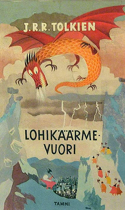
Tove Jansson’s Illustrations for The Hobbit.
 I came across something recently, that I had no idea existed… It was a collection of illustrations by a Finnish writer and illustrator for a Swedish edition of book by an English writer and illustrator…
Growing up, I was a huge fan of both Tove Jansson’s Moomintroll stories and J.R.R. Tolkien’s tale of The Hobbit and in fact still have all of my old 1970’s editions on the shelves here, having dragged them around with me over the years.
 So it comes as something of a surprise to find out that the two are so directly linked…
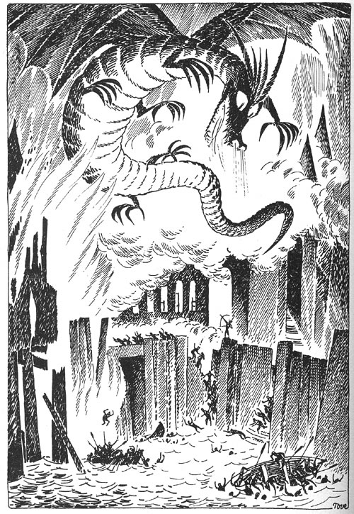
Originally commissioned in 1960, Jansson took the best part of two years to produce the illustrations, however upon publication of the book in 1962, her black and white drawings did not attract the universal acclaim that the publishers had hoped for.
Whilst many of the illustrations were regarded as successful interpretations of the story, there was criticism that Jansson had ignored much of the intricate and detailed descriptions that made Tolkien’s writing so beloved by so many.
For instance, think of Andy Serkis’s portrayal of Gollum in the recent Peter Jackson films, widely regarded as uncannily spot on, and compare that to this image of a not very skinny, and not very obviously something that once was a Hobbit…

Similarly the figures in image below don’t really bring to mind the elegance, finesse and otherworldliness of the beautiful elven folk of Mirkwood…
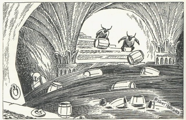
Still, the other images I’ve found are all rather wonderful, rich and evocative of the characters and story…. I’ll have to see if I can find an original copy for sale somewhere online, oh and learn to read Swedish as well…


Simon Stålenhag
Another find by my good friend Mr. Wong in the form of some rather fine paintings by the Swedish artist Simon Stålenhag.

Wong emailed the link below saying you’ll like these, and he was not wrong. We both agreed that the juxtaposition of the achingly familiar (landscapes, cars, kids, junk yards) with more, other worldly entities was a winning formula, bringing a sense of the humdrum to what should in all normal respects, be life changing events…

Im also a fan of the style in which Stålenhag paints these images, not hyper real or neon coloured, but low key, with an almost sketchy quality that only adds to the feeling that these could be real happenings that the artist has somehow managed to capture…
In a similar vein (but this might just be me) I can see echoes of the Ladybird book illustrations that meant so much to me in my childhood, illustrations that made the mundane and everyday, seem somehow more special.

More of these wonderful images can be found here


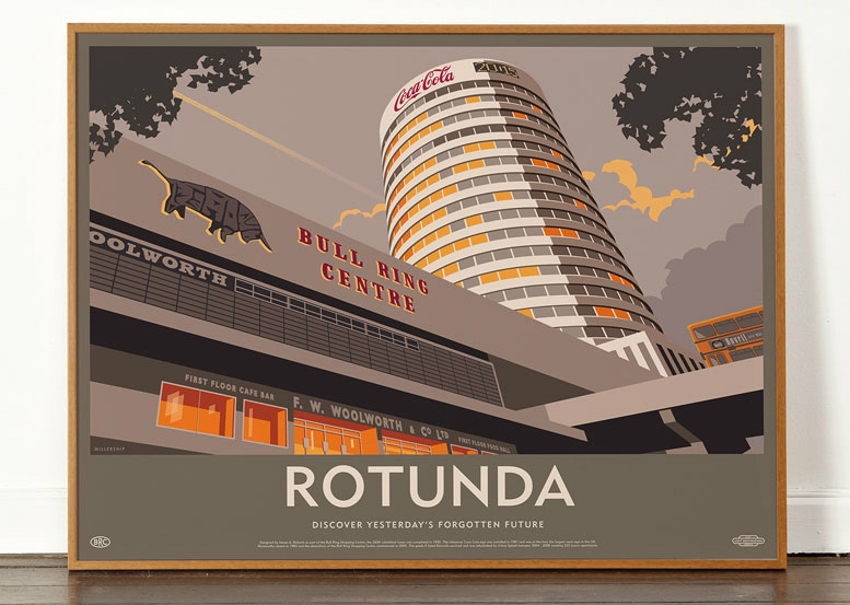
Yesterday’s Forgotten Future…
I came across these rather excellent images recently.

They’re produced by a group that goes by the name of Dorothy (wearedorothy) a graphic design/ arts studio whose “about” page tells me that their work has been variously described as ‘beautifully clever’ and ‘terribly wicked’. Whatever, they obviously have very similar tastes to me…
These images are part of a series entitled Lost Destinations, although I prefer the sub title they use on each print and which I’ve used to title this post.. The idea of yesterdays ideal architectural solutions becoming derided and forgotten tomorrow, as materials, theories and tastes develop and change is something that interests me greatly.

Visitors to these pages will instantly understand why these prints appeal: demolished/ forgotten/misunderstood brutalist architectural masterpiece? (check), block colours and strong shadows? (check), simplified graphic/ illustrative styling? (check), dynamic viewpoint with portentous sky? (check), classic sans serif font? (check)….

And what’s more, at £35 each for 5 beautiful colours on very nearly half a square meter of 120gsm uncoated art paper, they’re an absolute bargain…


Steve Cobby : Everliving
After what seems like an age of not having written anything, I’m back with renewed vigor and enthusiasm after a week in the sun, suggesting things you didn’t know you wanted to know about, but that I find fascinating…
 First up is one of dance music’s truly unsung geniuses whose newly released album Everliving is very, very good indeed…
I first met Mr Steve Cobby in the mid 90’s when he was one half of a band called Fila Brazillia with Dave McSherry. My good friend Danny Kudos was in the enviable position of manufacturing and distributing all the excellent music put out by Fila and the other electronica bands on Hull’s finest label, Pork Recordings, a label jointly started by Steve and the semi-legendary Dave (Porky) Brennand.
Me & Dan saw Steve and the other Pork boys whenever they came down to London to play (which was often) in excellent venues that no longer exist: upstairs at Turnmills, The 333, The Vibe Bar and The Blue Note to name but 4. As an aside, they were the very first DJ’s I knew about that used CDJ’s, lugging their own machines all the way down from Hull…
Anyway, with the release of this new album, it’s reassuring to learn that Steve is creatively still firing on all cylinders. Everliving is a wonderful thing: down tempo, up tempo, reminiscent, contemporary, familiar and challenging all at the same time. Everything you would expect and more…. The cover painting by Derklox-Cloxboy is pretty excellent as well…
Fila Brazillia’s LP’s “Maim That Tune” and “Old Codes, New Chaos” and Steve’s previous solo work as Solid Doctor (especially “Beats Means Highs”) have never left my all time favorite records lists, but other than odd snippets from Danny, I’d lost touch a bit with Steve’s more recent career if I’m honest. I’d listened to (and enjoyed) last years Saudade LP, but it didn’t grab me in the same that Everliving has over the last week or so…
But after a quick search through the web, it turns out that Mr. Cobby has been anything but slack, writing under a string of aliases, including J.J. Fuchs, J*S*T*A*R*S and The Cutler (with Porky) and has fingers in many other projects, including producing the music that accompanied Hull’s successful City of Culture bid for 2017; forming Hey, Rube! with Stephen Malinder, ex Cabaret Voltaire. Needless to say I was a massive Cabs fan back in the day (a link to their band camp page is here, and it’s sounding pretty good to my ears).
And finally it seems that Steve has been working alongside Darren Emerson, yet another person I rate very highly, on his (hopefully) soon to be released solo album.
Honestly you turn you back for a minute….
Mac Conner: The Man who drew the American Dream…
We went along to the House of Illustrations Gallery in Kings Cross on Good Friday to see a small exhibition of the work of the commercial artist most closely associated with Mad Men era New York.

Macaulay (Mac) Conner was a Madison Avenue based illustrator whose work graced the pages of the many 1950’s and 60’s lifestyle magazines published throughout North America, a country swollen with pride and full of optimism for the future, where success, wealth and a perfect family life in the suburbs were the corner stones of the American Dream, readily available to everyone who read the articles and features that Conner’s work accompanied.

And whilst we may look back at those times now as more divisive, with their conspicuous racism, latent sexism and rampant consumerism, in the simple terms of what Mac Conner was commissioned to illustrate, his ability to capture the very essence of those heady times is unquestionable…

As with many exhibitions, the images accompanying this post, wonderful though they are, do not really do the originals justice. Almost all the paintings on show were produced using gouache on board, allowing Conner to paint faces and figures with a confidence and ability that is endlessly impressive.
Conner was also something of a stylist, using devices such as a limited use of mid tones for skin or a single block colour such as the green above or the purple below, to give the images greater presence.

And in his own small way he was also a rebel. The restrictions imposed by commissioning editors were, as I understand it, if not draconian then certainly restricting and Conner’s inclusion of strong women, intimate positions (for the time) and black faces is certainly worthy of credit..
So an excellent little show and a marvelous insight into an era that we really only see these days, through the filters of the 21st Century.


Secret 7″. Still not good enough…
Sadly my three submissions for this years competition have been rejected once again, which apart from being disappointing, is a bit of a shame as I’d tried to assess why last years efforts didn’t make it and do something more in keeping with those that got chosen, i.e. less photos, more colours, less realism, more graphics…
Maybe I shouldn’t feel too bad. There were over 4500 entries for the 700 sleeves available, which if you’re new to the excellent Secret 7″ project, equates to 100 separate, individual designs for each of their seven chosen songs. I also imagine that another 100 or so sleeves will be allocated to guests and invited artists submissions (which is totally fair enough btw) so the actual sleeves available for the rest of us is probably nearer 600.
Still as with last years, I really enjoyed making them, so I’ll probably give it another whirl next year… It’ll be interesting to see the exhibition at Somerset House in a couple of weeks time, see what I can learn this time around.. (which is probably that I will always be a year behind in terms of style…)
My submissions were a suitably psychedelic sleeve for Let Forever Be, by The Chemical Brothers:  The imprints of hammer blows for Peter Gabriel’s Sledgehammer:
 And the silhouette of a greyhound for Underworld’s Born Slippy…

Exhibition of Mid Century Latin America Architecture…
Arch Daily have just informed me of an exhibition which starts at the end of March. Unfortunately for me it’s at the MOMA in New York …
Entitled Latin America in Construction: Architecture 1955-1980, it sounds like something right up my street, full of idealistic 1960’s and 70’s designs, when imagination was only limited by the ability to which it could be drawn
These two images in particular caught my attention.
The first is from 1969 and is a magnificent proposal for a hotel at Machu Picchu, Peru by Miguel Rodrigo Mazuré. Having been lucky enough to visit Machu Picchu a few years ago, I can imagine where this was probably going to be located, on the slopes above Aquas Calientes, where the buses on the switchback road slowly take you up to the citadel and a sight that I will never, ever forget…
As such my heart tells me that I’m quite pleased it wasn’t built. But my head absolutely loves it.. all those cantilevers and cable cars and funicular railways and dynamic concrete planes.. ohhh, yes please…

This second image is slightly more conceptual in that it appears to have a record cutting lathe acting as a central civic hub of some form, with routes in and out being represented by oil refinery pipework.
It still looks bloody marvellous though…. I can’t find anything about this image from the exhibition blurb, but it looks a little bit like it’s sitting in the beautiful Peruvian valley of Cusco, so again, probably a good thing it never made it off the drawing board…

So all in all, it looks like it could be a good exhibition, although unless it crosses the ocean, one I won’t get to see. I’ll have to find out if there’s a shiny and informative, fully illustrated book to accompany the exhibition (and let’s face it, there usually is..) and be satisfied with that…
My own small contribution to spreading the word of South American post war architecture was a piece I wrote a couple of years ago for the Modernist Magazine, about the Argentinian Brutalist architect Clorinda Testa, whose work in Buenos Aires, I found particularity memorable and deserving of far greater recognition worldwide…

