Archive
JVB
A NEW APPROACH…
I’ve been thinking about this quite a lot recently, about getting back to writing longer pieces and reinvigorating this outlet for some musings on a variety of topics that interest me and that rise through the background fuzz of daily life to demand a bit more attention…
In response to these thoughts and in an effort to keep things fresh, I’ve come up with a new approach on creating posts for this blog.
By setting myself some (and it has to be said, fairly arbitrary) limits within which to write, my intention is that all future posts will be shorter, more focused and consequently easier and quicker to read.
In the UK, the average reading speed is around 225 to 250 words per minute, so taking that as starting point, the new “JVB” subtitle to the original blog can be interpreted as follows:
The J & B reference back to the original JoeBlogs title.
The “V” represents “five” : maximum 5 minutes to read, maximum 500 words, 5 images, 5 paragraphs…
(It’s also a little play around on the more familiar JCB & JVC logos, which quite appeals…)

I did think about starting a new blog, making a fresh start, but that does seem rather a perverse move, as over the 13 years or so since I started writing, I’ve written much that I’m proud of and have created a significant body of work that has attracted a staggering number of visitors, comments and followers.
So, I’ve decided to keep the old blog and just carry on with this page of minor explanations as to the blogs future development…
So, let’s see how we get on shall we?…
Congress House : An Overlooked Modernist Masterpiece…
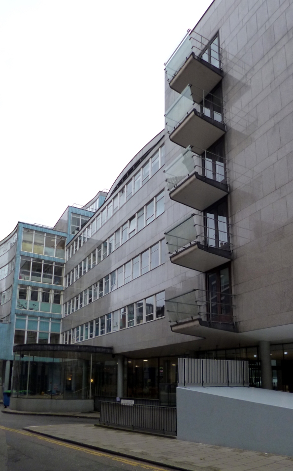
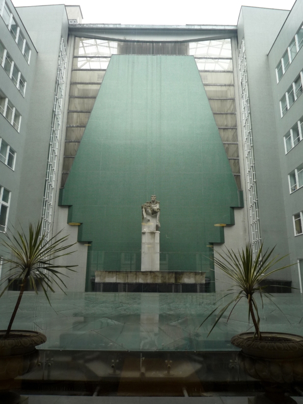 Without doubt one London’s finest modern sculptural masterpieces is perversely, also one of the most difficult to find, hidden away as it is in a beautiful green mosaic tiled (originally Carrera marble) and glass enclosed courtyard at the heart of one of London’s least known modern architectural gems.
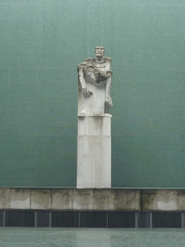
The sculpture is easily one of Jacob Epstein’s most powerful works: A mother stands cradling her dead son, staring forlornly up into the sky, the look of pain and anguish clearly etched upon her face. The building is Congress House, the headquarters of the TUC, a building conceived in 1945, but not completed until 1957, and the story of these two modern masterpieces makes for quite an interesting read.
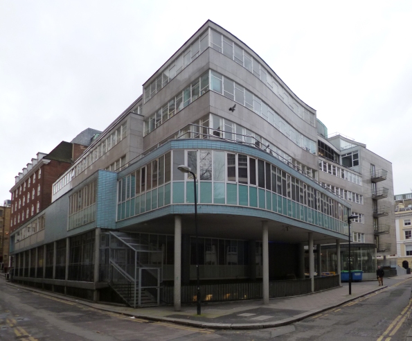
Congress House on Great Russell Street, just opposite the British Museum, was the result of a 1948 open competition, one of the first and largest post-war architectural competitions to be organised, and at a time when the likelihood of such a large, totally new structure being completed were severely limited by the restrictions and rationing of building materials.
The brief for the project, developed by the TUC over a number of years, had to address two key objectives: Firstly it was to provide a fitting memorial to those Trade Union members who had laid down their lives during the two World Wars, and secondly it was to provide high quality conference, education and meeting room facilities suitable for the progressive aspirations of the Union.
With over 170 entries submitted, choosing an outright winner was always going to be a challenge. All entries were put on public display, and though it’s not clear if the public had a say in the final choice (unlikely I would suggest in 1948), the eventual winner was announced by the RIBA as the (still) little known 35 year old English architect, David Du Rieu Aberdeen.
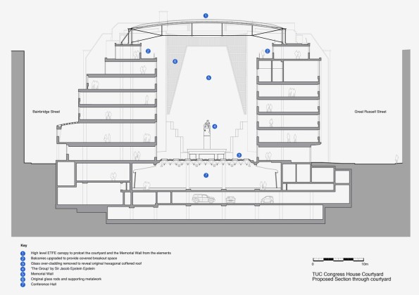
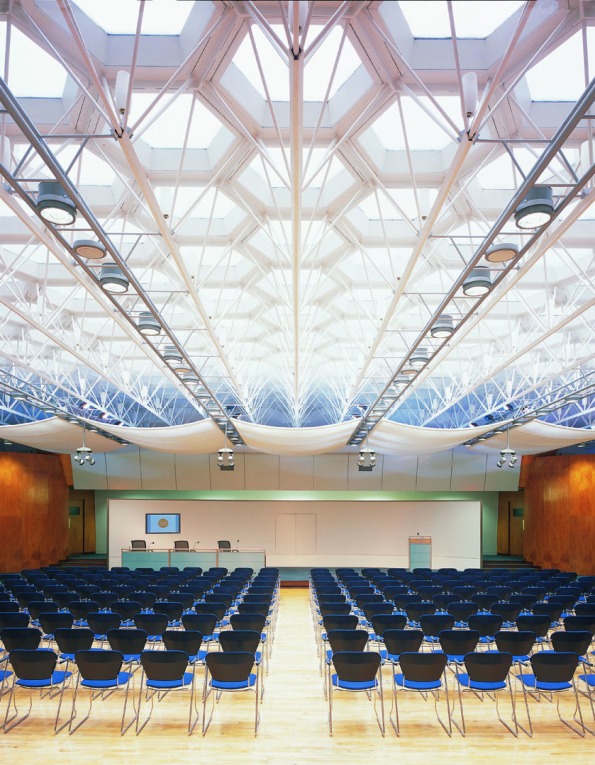
Du Rieu Aberdeen’s scheme had as its focus a large open courtyard surrounded on three sides by the offices, library and committee rooms that were key to the new building. The fourth side, against which the proposed memorial sculpture would stand, was the existing end wall of Sir Edwin Lutyens YWCA building, and which was protected by local building regulations. The floor of the courtyard was finished in a large, hexagonal segmented glazed structure, which also formed the ceiling of the below ground conference center and allowed light to flood into the subterranean spaces. Wherever possible materials were sourced (and often donated) from other trade unions and overseas labour organisations and included marble, polished granite and cedar, all of which added to the quality of the building and kept the costs within budget.
Getting the project started proved to be difficult. Narrow streets, height restrictions imposed by the historic nature of the site (previously a brewery and a warren of alleyways known as “The Rookery”), the protection afforded the adjacent Lutyens building and an understandably rather chaotic post war approach to redevelopment, resulted in a 5 year delay between Du Aberdeen’s appointment and works beginning on site. On the positive side, the delays did allow Du Rieu Aberdeen to work comprehensively through the scheme in detail, giving due consideration to all aspects of its design, especially key elements such as the feature main staircase, the glazed conference center roof and the composition of the external elevations.
The style of the building took its cues from a number of sources. The curving plan forms, pilotis (columns) and ribbon like exteriors of Le Corbusier’s modernism being the obvious one, but there are also hints of the more naturalistic interwar Scandinavian modernism of architects such as Gunnar Apsland and Alvo Aalto.
It’s no coincidence I might suggest, that the building shares similarities with the Royal Festival Hall, conceived as they were around the same time, 1947/48, and in a Post War atmosphere of optimism that allowed the younger members of the architectural profession opportunities to show what Modernism might begin to offer.
It is also undoubtedly true that the huge political will driving the success of the Festival of Britain, qresulted in the Royal Festival Hall being completed on time in 1951, i.e. some seven years before Congress House was officially opened, a success that arguably stole its limelight in the eyes of the public, forever relegating it to relative obscurity.
Jacob Epstein’s commission for the memorial sculpture came around 1955, two years after construction on the building had finally begun and is a masterful display of carving. The composition is loosely based on Michelangelo’s extraordinary Pietà at St. Peters Basilica in Rome, and with a scale (it stands almost 6 meters high on its pedestal) that leaves you in awe of the memorials presence. Epstein’s ability to manipulate solid stone to express human emotion and fragility almost leaves you speechless, creating a a wholly fitting and moving tribute to the sacrifice of the Unionist soldiers of the two wars.
In acknowledgement of the success of the project, in 1959 the RIBA awarded Du Rieu Aberdeen its prestigious Bronze Medal London Architecture Award and in March 1988 the building received Grade II Listed status securing it and Epstein’s wonderful sculpture for future generations to enjoy, describing it in the Listing as “as one of the most important institutional buildings erected in London, and one of the most significant 1950s buildings in Britain”.
Well worth a visit next time Open House comes around….
This post is an edited version of one that first appeared in issue 22 of The Shrieking Violet from 2014.
Expo in The Manchester Modernist: Video review
Writing the last post on Expo ’58 has reminded me that I didn’t post my regular outburst of shameless self publicity by informing you that those lovely people at the ever excellent Manchester Modernist have once again been good enough to include one of my offerings in the current issue of their redesigned and relaunched magazine…
A relaunch that was possibly thanks to the unqualified success of its recent crowd funding campaign. So a huge thanks to everyone who contributed in whatever form…
But don’t just take my word for how good the magazine is… Why not watch this very complementary video review by Stack…
And just in case you missed it.. mine was the piece towards the front all about Basil Spence’s stylish British Pavilion at one of the most successful of all such Twentieth Century events, Montreal’s Expo 67. This piece was a reworked and greatly expanded version of an original post here… (which also had lots of photos)
Copies of the magazine are available to buy either singly or via annual subscription here…
A Name Check in ArchDaily: Manchester Modernist Magazine…
 ArchDaily have just published an article praising the ever excellent Manchester Modernist, a quarterly architecture and design magazine that has been good enough to publish a number of my submissions over the last couple of years.
I won’t go on about it too much, blowing my own trumpet so to speak, but to say I’m well chuffed would be something of an understatement, especially as I get a name check and they describe my piece on Post War Crematoria as “uplifting”…
The full article can be found here and you can get to the Manchester Modernist pages to buy a copy of the magazine here…
Better still, why not subscribe and get several copies and a stylish metal badge? Use this link for full details via the crowd funding page at IndieGoGo.
(and yes I know I originally said it was in Dezeen, but I got all excited and didn’t read the banner properly…)
The Modernist Magazine. Issue 10 – Dictator… (or me and Mr. Meades)
 This rather fine redacted front cover is the latest edition of The Modernist, the quarterly design based magazine based up in Manchester that is gaining both plaudits and acclaim for its style and content..
 The theme for this issue was Dictator, and the editors were once again kind enough to include a piece I submitted, about the almost comical Benito Mussolini, who virtually alone amongst dictators, was either unable or unwilling to choose a definitive architectural style to define his misguided idealism, a situation which resulted in a wide range of styles and building types being constructed throughout the inter war years.
And in something of a personal triumph in this edition, I have the very great and unexpected honour of seeing my name on the same page as one of my literary and televisual idols, Mr. Jonathan Meades who when recently asked by the editors to become Patron of the Society, is reported to have said that he was “honored… and given some of the things I’ve said about Manchester’s recent architecture, bemused.”
Meades is a man whose contribution to the ongoing cultural debate is immeasurable. He makes idiosyncratic documentaries that are in equal measures odd, entertaining, annoying, amusing and informative. And even if I have to admit that, due to his penchant for listing and connecting seemingly disparate names and ideas, I often find myself losing the thread of his arguments (which I suspect is a deliberate ploy), I could easily listen to him talk about architecture all day…
Towards the back of the magazine, you’ll also find my review of William Mitchells’ excellent new autobiography “The Eyes Within”, a hugely enjoyable read from a man well into 80’s whose ability to make and draw things has taken him all over the world…
Manchester Modernist Magazine – MKII
 I’m very, very late with this post, in fact it was only writing the previous one that reminded me…
The Manchester Modernist which has been good enough to publish a number of my submissions has done so again in their latest issue, which actually came out at the end of last year.
After an impressive eight issues over the last two years or so, the Editors have understandably decided to update the layout and appearance of their magazine, to help keep it fresh through the next couple…
This first offering in their new livery (Issue 9/ Dinky) takes an obvious cue (to my eyes anyway) from Ben Kelly and Peter Saville’s work at that most infamous of Manchester’s cultural institutions The Hacienda, which is a pretty cool move for a magazine devoted to post war arts and culture, especially when so much of contemporary culture is about re appropriation and reinterpretation. And anyway, it’s probably only the 40 somethings like myself that would associate hazard stripes with Manchester…
My “dinky” piece is all about the graphic artist and designer David Gentleman and his work with Tony Benn in the early 1960’s to modernise that most ubiquitous and overlooked of mini masterpieces, the humble postage stamp…
Why not treat yourself and buy the issue here. It’s only a couple of quid, or subscribe and get the next four issues. It’s a fascinating read and deserves all the support it can get…
Congress House in The Shrieking Violet Issue 22…
 I’ve recently had another of my attempts at writing published in The Shrieking Violet, so a big thanks to Natalie for that.
It’s a short piece about one of the least known modern architectural masterpieces in London, which also houses one of the best modernist sculptures ever carved (imho obviously…)
The commission to design a headquarters building in Central London for the Trades Union Congress was won in one of the first and largest post war, open architectural competitions by the then (and even now) little known architect David Du Rieu Aberdeen in 1948. War shortages, changes to the brief and politics delayed the project start until the early 1950’s, so that it wasn’t until 1957 that the building, with Jacob Epstein’s truly wonderful and unforgettable memorial at its heart, was finally opened for business.
Why not visit the excellent Shrieking Violet and read the whole piece? It’s an interesting story about the challenges of getting something brand new and very modern, built in a city that was still struggling to provide basic infrastructure and housing after the devastation of the War…
In praise of the Monorail…
 I’ve recently completed and submitted (for hopeful publication in a respected arts and culture magazine) a short piece of writing all about the wonders of the monorail, in my opinion, a timeless and much misunderstood mode of transport that deserves far greater support.
The essence of my argument is that the monorail’s almost Pavlovian depiction as THE earthbound transport of the future, has resulted in it being underused and mistrusted as a viable urban commuter option in the large majority of today’s’ Cities..
Evidence, I suggest, can be found in countless imagined future cities in countless films, books, comics and TV programmes of the last 100 years or so: Fritz Lang’s Metropolis (1926), Things to Come (1936) Francois Truffaut’s Fahrenheit 451 (1966), in Mega City One (Judge Dredd’s home in 2000AD) and Logan’s Run, the writings of Arthur C Clark, Philip K Dick and Iain M Banks to name just a few.
Couple this often over exaggerated and/ or improbable Sci-Fi imagery with the monorail’s undeniable association with novelty rides, at things like World Fairs, Disney Land resorts and countless airports and zoo’s the world over, and the character assassination is complete…
Thankfully however, attitudes have been changing over the last couple of decades or so, and successful urban transport systems can be found in Sydney, Kuala Lumpur, Tokyo and Moscow to name just a few of the forward thinking cities who have recognised the many benefits of electrically operated aerial monorails including reduced land take, reduced emissions and quiet operating volumes.
Due to copyright reasons, it’s difficult to include found and uncredited images with written articles published in proper magazines. On my blog of course no such restrictions apply, so I’ve collected below some of my favorite images, ones that I think best illustrate the idealism, excitement and overall futureness of the monorail…
Argentinian Brutalism: Clorinda Testa in Buenos Aries – Manchester Modernist
 Those wonderful people at Manchester Modernist have again chosen to publish one of my submissions.
In the latest issue Capital, I’ve written about the little known Argentinian architect Clorinda Testa, a man whose love of massive, brutalist concrete structures, seemingly knew no bounds…
It was whilst we were on our World Tour, that me & A came across two remarkable buildings tucked away in the tree lined streets of the capital, Buenos Aires: The Bank of London and South America (1959 -1966) and the National Library of Argentina (1962-1992).
The interesting story of how these two buildings came about involves numerous Military Coups, huge delays, collapsing economies and sheer determination on the part of the architect, well worth a read (even if I do say so myself).
I’ll leave you with some of the photos that I took when we were there to give you some idea of the scale and vision of Clorinda Testa, a name that should certainly be more well know that it is… (the bank is first, down to Testa’s original concept drawing and then the library)
Frank Dobson in The Shrieking Violet…
 The Manchester based webzine The Shrieking Violet has just reached an impressive 20th edition, so a huge congratulations to its founder, curator and editor, Natalie for such an achievement. Long may she continue to self publish…
Natalie has been kind enough once again to include a piece I wrote about a largely forgotten and overlooked artist Frank Dobson, a man who in the 1920’s was considered by many critics as amongst the first and best of British Modern sculptors, ranking alongside the likes of his fellow Englishman Eric Gill as well as the American Jacob Epstein and Henri Gaudier-Brzeska who was French.
Dobson’s is a sad story to some extent. Despite being at the very cutting edge of early Twentieth Century modern art, time and changing tastes were not kind to him, and through a refusal to move away from a romantic, figurative style generally (and the female nude specifically) his work was eclipsed by the likes of Henry Moore and Barbara Hepworth, as their radical reinterpretation of abstract forms made him look old fashioned and out of touch, so that today his name is barely a footnote to most art histories…
A screen grab of my article is below, but I would urge you to visit The Shrieking Violet site on the link above and have a look through some of the previous editions.
