Archive
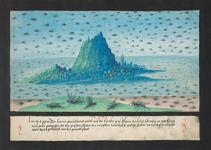
The Book of Miracles
The recently reformatted and republished Taschen version of “The Book of Miracles” is truly a wondrous thing.
A mirror to the hopes, beliefs and fears of the northern European Renaissance mind, it is a collection of nearly 170 mesmerising watercolour and gouache paintings, that illustrate through a fantastic combination of bold images and vivid colors, a cornucopia of long accepted visions, miracles and wonders from both biblical and secular life.
Astral happenings, dragons & multi-headed monsters, plagues and visitations, spectral apparitions, birth defects, messages from the heavens and other unfathomable acts of God, are all beautifully captured with imagination and skill.

Commissioned, written and illustrated by wholly unknown sources, the book was originally produced as a folio of images and published in Augsburg, Southern Germany in the mid 1550’s.
How well it was received, how popular it became is not recorded, what is obvious however is that it effectively disappeared from history. That is until an almost intact copy of the manuscript came to light less than 10 years or so ago.
It is this amazing find, along with a handful of previously known pages that can now be seen as being obviously part of the original publication, that Taschen have used to create this latest edition.

The miracles depicted range chronologically from the early stories of the Old Testament and The Book of Revelations, right through to contemporary 16th Century Europe, with the spires and towers of Augsburg itself clearly playing a key part in setting the narrative.

Many of the miracles collected in the book are clearly based on earlier, popular and widely distributed woodblock illustrations by the likes of Albrecht Durer, Hans Holbein and Cranach the Elder, and it seems likely that whoever commissioned this amazing work, was looking to collect and document in a consistent and easily understood style, all the miracles that were known up to that time.

Although these images look undoubtedly dated through our 21st Century eyes (I used the word naive previously) they still have the power to inspire & intrique. I can’t help but wonder if the people that drew these monstrous and fantastical pictures, really believed in them fully. Did their overwhelming faith and fear of the Almighty drive them unquestioningly on, or was there a little voice in the back of their mind saying.. “hang on a sec, five suns in the sky at the same time? Really?..


Simon Stålenhag
Another find by my good friend Mr. Wong in the form of some rather fine paintings by the Swedish artist Simon Stålenhag.

Wong emailed the link below saying you’ll like these, and he was not wrong. We both agreed that the juxtaposition of the achingly familiar (landscapes, cars, kids, junk yards) with more, other worldly entities was a winning formula, bringing a sense of the humdrum to what should in all normal respects, be life changing events…

Im also a fan of the style in which Stålenhag paints these images, not hyper real or neon coloured, but low key, with an almost sketchy quality that only adds to the feeling that these could be real happenings that the artist has somehow managed to capture…
In a similar vein (but this might just be me) I can see echoes of the Ladybird book illustrations that meant so much to me in my childhood, illustrations that made the mundane and everyday, seem somehow more special.

More of these wonderful images can be found here


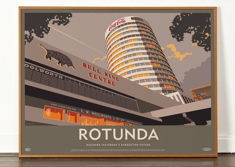
Yesterday’s Forgotten Future…
I came across these rather excellent images recently.

They’re produced by a group that goes by the name of Dorothy (wearedorothy) a graphic design/ arts studio whose “about” page tells me that their work has been variously described as ‘beautifully clever’ and ‘terribly wicked’. Whatever, they obviously have very similar tastes to me…
These images are part of a series entitled Lost Destinations, although I prefer the sub title they use on each print and which I’ve used to title this post.. The idea of yesterdays ideal architectural solutions becoming derided and forgotten tomorrow, as materials, theories and tastes develop and change is something that interests me greatly.

Visitors to these pages will instantly understand why these prints appeal: demolished/ forgotten/misunderstood brutalist architectural masterpiece? (check), block colours and strong shadows? (check), simplified graphic/ illustrative styling? (check), dynamic viewpoint with portentous sky? (check), classic sans serif font? (check)….

And what’s more, at £35 each for 5 beautiful colours on very nearly half a square meter of 120gsm uncoated art paper, they’re an absolute bargain…


The Android Invasion: William Mitchell & Doctor Who…
Don’t ask me why, but I started watching an old Doctor Who the other evening. I’d scanned the TV page looking for something to watch as I ate my tea, and as I read the title “The Andrid Invasion”, a vague recollection of a faceless, robot version of the lovely Sarah Jane (Elizabeth Sladen) popped into my head…
 Dating from the mid 1970’s and starring my personal favorite Doctor, Tom Baker, it is to be honest, a rather shonky affair that probably would have been better left as a memory.
The acting, the sets, the story, the effects, all conspire to produce something so frighteningly low key (even for the 70’s) that I’m amazed we all watched these shows so avidly at the time. And as for the androids and their alien masters … men in white boiler suits and crash helmets with guns built into their pointing finger, and little trolls. Hmmm…
Anyway, about half an hour in I was just about to give up when what should the Doctor walk out from behind, but something that looked remarkably like a sculpture my friend Bill Mitchell might have made…
A couple of screen photos and an email to Bill and sure enough, a genuine Mitchell it turns out to be…


Bill tells me this work dates from the early 1970’s and was created using his sand blasting technique to carve away at solid lumps of brickwork. It’s located at the Harwell Atomic Center near Oxford and at the time was a very hush hush commission for him, due to the nature of the atomic research and the secrecy of the Cold War. he sent me this photo he took after it was finished. Bill also did some work inside the building apparently, but that didn’t appear in the show…


The building itself looks quite interesting to my eyes. Beautifully made precast concrete panels clad the walls and as for the cantilevered entrance canopy above, very stylish…
Bill tells me the commission came from the War Office, for whom he also did work at a “secret tank factory”. I think I’ll have to ask him to tell me more about that one..
Sadly like many of his external sculptural works from this period, Bill doesn’t know if it’s still there and from online aerial sites it’s difficult to tell, as the greenery has matured considerably since the BBC set up their cameras to film a man in a long scarf running past.

Having looked at aerial photos trying to work out where Bill’s work might be on the campus, I couldn’t help but notice the massive, doughnut shaped building that goes by the intriguing name of The Diamond Light Source. And so the seed of another post is planted…

October Roundup : Music & Art, Swearing & Skating, Poppies & Birthdays…
What with one thing and another (mainly updating my portfolio, applying for and getting a new job, a nerve wracking experience that I haven’t been through for about 9 years) I’ve not had the chance to write much recently, which is a shame as we’ve done some excellent things together this last month. So what better excuse for a mini roundup as a way of recording them all…
 Firstly there was our annual trip to Bedrock land to hear the mighty John Digweed spinning his tunes into the early hours. This year though, as he was promoting his rather excellent Traveler album there was a launch party at Plan B in Brixton and we, along with surprisingly few others, had the pleasure of a private play through.
The three fine fellows in the photo are JD himself, his musical accomplice Nick Muir and the Bedrock label manger Scott Dawson. Middle aged blokes in black, proper pop stars or what?..
Taking of middle aged blokes, we went to see Underworld at the Royal Festival Hall, playing their seminal album dubnobasswithmyheadman from start to finish, plus all the other tracks from that early 90’s that so fired me up at the time, Spikee and Rez sounded particularly wonderful. I got all a bit over excited and sang along loudly to most of the tunes most of the time, so apologies to M, D and A for that, but they all knew how much much this music means to me when they agreed to accompany me…
Easily one of the best gigs I’ve been to for ages…


Then we were lucky enough to be invited to the private view of Lucy McLauchlan’s new show at the Lazarides Gallery.  Lucy is a truly excellent and gifted young artist whose immediately recognisable work moves effortlessly from the street to a gallery. There was an interesting selection of new work based around bark textures and florescent colours, however it was this gridded arrangement of painted timber panels with her trademark swirls and lines that was particularly satisfying.
Lucy had just returned from China where she’d been invited to create a mural high above the streets of central Guangzhou. Check out the video below for a little taster. How on earth she so effectively translates the scale of her work from sketch book to such gargantuan proportions is beyond me, and to be doing it that high up off the ground and from a wobbly cherry picker… I bet they don’t teach you that in College…
There was also a little after show party at the newly opening Mondrian Hotel at Sea Containers House on the South Bank which topped the evening off very nicely, with stunning views over the river (shame it was raining so hard though). I wrote about Sea Containers House several years ago actually when it was empty and being used as a giant advertising hoarding, so its good to see that it’s finally being occupied again. (Photo stolen from Dan, mine was rubbish…)

A trip to the hidden and graffiti soaked under crofts of Waterloo to see my friend’s son skateboarding was the only excuse we needed to visit the House of Vans, and what an amazing place it is. Buried deep below the station platforms, carved out of impressive Victorian brick arches, two skate areas, a bar, a cinema, a gallery space, a club space and a rather excellent cafe (the BEST scrambled eggs on sourdough I’ve had in many years and only £4..).
No idea how long it plans to be there, but with such excellent and affordable food and free skate sessions, I should go see it quick before someone at Vans realises the maths don’t work…


The Modern Toss exhibition in Shoreditch was small but good fun. Silliness elevated to art but done with so much swearing that you can’t help but be impressed. The same could not be said for the The Lego exhibition in Brick Lane however, which was very average and not worth paying to see. The tag line The Art of the Brick is easily the misnomer of the year. Lots of bricks, f*ck all art (as the Modern Toss boys might describe it…).
We’ve been several times over the last couple of months to the field of ceramic poppies at The Tower of London, but now it’s finally complete, it really is quite something to behold.
Repetitive art on a large scale is almost always impressive (Ai Wei Wei at the Tate for example or Anthony Gormley’s Field for the British Isles) and with Blood Swept Lands and Seas of Red, Paul Cummins has undoubtedly created a very powerful installation to mark 100 years since the start of WW1 and to remember the 888,246 British soldiers who lost their lives during the conflict.
(And yes I did read Johnathon Jones’s piece in the Guardian, and yes he does make some very valid points about not addressing the realities of the war, but I would still contend that this work is both appropriate and moving, especially when you see it first hand. Making the visual connection that each of the poppies represents a life lost, can’t fail to make you stop and think, and the work certainly deserves its place in the Remembrance .)

And then finally at the end of October, my lovely girlfriend’s birthday celebrations, which once again she managed to stretch out for nearly a whole week… Happy Birthday And, love you lots xx.

So all in all a most excellent month, busy and full of stuff… Which of course is why we live in London, and why I love this city.
Lazy Post No. 22 : 1010 (Street Artist)
A very quick and lazy post today (I might come back to this guy when I have a bit more time).
1010 is a German street artist based in Hamburg. He’s produced many styles of street art over the years but for the last 2 or 3 has been creating these fantastic 3 dimensional voids.
The overriding feeling I have looking at these shapes, is how wonderful it would be to see one in the flesh, so to speak. The effect of depth that these images convey is hugely impressive, and its only little things like the area of missing render cutting across the triangle in the image below, that belies the fact that the wall is flat.
Very clever indeed…


The Future Library Project…
This has caught my imagination today…
Katie Paterson, a young Scottish artist has had, and implemented the most wonderful idea. Over the summer she and her team have planted over 1000 trees in a beautiful forest wilderness called Nordmarka, about 20 minutes outside Oslo in Norway.

Every year for the next century, a respected writer will be invited to submit an offering to the Project, which sounds like an excellent idea in itself, but there is a cunning twist. All the submissions will remain secret and unread by anyone until 2114, i.e after 100 years have elapsed. Then and only then, will the trees be chopped down and pulped to make paper sufficient for all the works to be printed, and then read for the first time…
 The first invited writer is Margaret Atwood, who understandably is very excited by the prospect. “It’s the kind of thing you either immediately say yes or no to. You don’t think about it for very long. I think it goes right back to that phase of our childhood when we used to bury little things in the backyard, hoping that someone would dig them up, long in the future, and say, ‘How interesting, this rusty old piece of tin, this little sack of marbles is. I wonder who put it there?'”
Over the intervening years, the submitted works will be stored under lock and key in a specially designed room in an Oslo Public Library, the walls of which will be lined with wood from the forest…
Paterson said that The Future Library “has nature, the environment at its core – and involves ecology, the interconnectedness of things, those living now and still to come. It questions the present tendency to think in short bursts of time, making decisions only for us living now. It freaks me out a bit when I think that many of the writers (who will finally be published in 2114) aren’t born yet.“
What a fantastic concept, I wish it every success, and am only marginally disappointed that I will never see it come to fruition…
I can’t help but remember those closing scenes of François Truffaut‘s masterful 1966 film of Ray Bradbury’s Fahrenheit 451, in which “human books” wander around a wintry forest reciting the passages they’ve committed to learn by heart, keeping the “written” word alive for future generations to enjoy…

The Ancient Chinese Culture of Sanxingdui…
 Via the magic that is Google Chrome, I finally got round to watching the recent Andrew Graham Dixon programmes in which he assesses the history of Chinese Art.
As with all of AGD’s art history shows, it was a rather mannered affair, full of confidently expounded theories and ideas, which when his subject is European or Western Art that he’s studied his whole life and in which his expertise lie, is fair enough. I’m generally happy to listen to what he has to say, cringing at some of his tenuous or rather laboured connections perhaps, but enjoying his obvious passion and bowing to his undoubted knowledge.
But I have to admit that I struggled with him on these programmes. The subject is obviously hugely diverse and richly fascinating, but I couldn’t help but get the impression that AGD is very new to the subject and was mostly winging it or relying heavily on more authentic Chinese art historians that were just off screen, diligently writing his script and helping him with pronunciation… Was there not a Chinese expert who could have guided us through their countries rich heritage?
Whatever… One aspect that has stuck with me from the first show however, was that of the amazing Sanxingdui culture…
Since the discovery in 1987, when workman uncovered two pits containing a large number of damaged bronze, jade and gold artifacts in Sichuan Province, Central China, theories around the finds have rapidly developed to the point that many academics contend that they are more important than the Terracotta warriors..
 Radio carbon dated to around 4000 years old, the seemingly discarded pieces were painstakingly reassembled over an eight year period to reveal a series of masks and heads that are striking in their appearance. Rumors of a mysterious and ancient tribe known as the Shu (translated as eye) people had abounded in the area for centuries, but it wasn’t until this discovery that any explanation could be given to the stories.
These beautiful masks with their protruding eyes, “enigmatic smiles” and stylised ears are like nothing else in China’s rich cultural history. They offer the first evidence of a Chinese figurative sculptural art (other than straight forward copies of soldiers in terracotta), a style that was thought until this discovery, to have never been part of the Chinese artistic language.
Its always interesting to compare timelines across cultures. 4000 years ago in the British Isles we were making simple stone carvings such as the Westray Wifey, whilst in Egypt the Naqada People were carving simple animal shapes. I think we can agree that the early Chinese cultures were well ahead of the curve in terms of technique.
Nearly 2000 objects were removed from the pits and these truly amazing works are now on display in a purpose built museum near the discovery site. No idea how easy it would be to visit, but it certainly looks like it would be worth it if you ever find yourself in the Sichuan Basin…


One final thought if you’ve got this far. As soon as I saw them, these figures reminded me of the fairly recent additions to Gaudi’s Sagrada Familia in Barcelona… It’s the emphasis on the eyes…

Anna Airy: Official WW1 Artist.
I visited the newly reopened Imperial War Museum (IWM) last week (post to follow), where I discovered a truly stunning painting and was introduced to a name that I’m disappointed I’ve not come across before now…

Anna Airy was born in Greenwich, London at the end of the 19th Century and after graduating from The Slade School in 1903, became one of Britain’s most highly regarded female war artists. The Daughter of an engineer and granddaughter of an Astronomer Royal, a love of detail and technology were very obviously in her blood from the off.
 Throughout most of the 20th Century it was not considered proper for women to experience war first hand (a situation that shockingly didn’t change until 1982 when Linda Kitson accompanied Troops to The Falklands). As a result female war artists work generally records activities well away from the front line, in hospitals, factories and farms and often of women themselves working hard for the war effort.
Towards the end of the First World War in 1918, Airy was commissioned by the Munitions Committee of the Imperial War Museum to produce a series of paintings recording day to day life in munitions and manufacturing factories across the country.
The painting that caught my attention at the IWM is the one above. Called Shop for Machining 15-inch Shells: Singer Manufacturing Company, Clydebank, Glasgow, it’s a large canvas painted in a slightly impressionistic style using a muted palette of colours. It depicts a huge timber and glass roofed shed from which hang seemingly endless pulleys and chains. The workers, all of whom appear to be women, occupy the center ground and are dwarfed by the massive shell casings which it is their task to produce in what can only be described as a state of organised chaos…
This wonderful image was one of at least five that Anna produced during 1918, the others being, A Shell Forge at a National Projectile Factory, Hackney Marshes, London (where according to Wikipedia “the ground became so hot that her shoes were burnt off her feet”)

An Aircraft Assembly Shop, Hendon

Women Working in a Gas Retort House: South Metropolitan Gas Company, London”

and The ‘L’ Press: Forging the Jacket of an 18-Inch Gun, Armstrong-Whitworth Works, Openshaw

All of these powerful and evocative images convey the noise, confusion and determined effort that the war so obviously brought out in people during those difficult times. The attention to detail is particularly impressive and it would appear that Anna particularly enjoyed painting roof structures.
As an aside, it’s fair to say that the role of female war artists has been pretty much overlooked until fairly recently, a combination no doubt of a general sexism and that the more harrowing pictures of human carnage and destruction from the front lines painted by the men, generally grabbed all the headlines. Thankfully this is now being redressed and there is a particularly good piece here by Arifa Akbar for the Independent, if you care to read further.
After the War, Airy concentrated her abilities more on portraiture and images that, like the munitions series above, still captured the day to day, but with a perhaps understandably more halcyon air. Blackberry Harvest (1937) below, is a typically fine and evocative example.

Basil Spence’s Expo 67 Pavillion, Montreal
![]() The 1967 Expo in Montreal, Canada is generally accepted to have been the most successful Expo of the Twentieth Century and must have been an amazing experience.
The 1967 Expo in Montreal, Canada is generally accepted to have been the most successful Expo of the Twentieth Century and must have been an amazing experience.
After the success of the New York Expo of 1964, the event was supposed to have been held in Russia to mark the 50th anniversary of the Revolution, but for reasons both political and financial, this was not to be and Montreal was awarded the prize in 1962.
Spread out over the newly created Isle Notre Dame and the significantly enlarged Isle St Helene, in the St Lawrence River, were 90 cutting edge pavilions representing if not all, then certainly a large number of the nations of the world. So not only could you have visited a proper Buckminster Fuller geodesic dome (USA Pavillion) and a genuine Frei Otto tensile steel structure (West German Pavillion), there was also Moshe Safdie’s iconic Habitat 67 Housing scheme, which attempted to redefine affordable urban living through its use of prefabricated concrete units arranged to provide both internal and external spacial variety and suggest a more suburban living in the heart of the city.
But it’s Basil Spence’s wonderful pavilion for Great Britain that has prompted me to write this post. I came across a selection of amazing images at the Royal Commission on the Ancient and Monuments in Scotland (RCAHMS), who are the trustees of the Sir Basil Spence archives and just had to put them up on my blog…
They appear to depict a huge, pure white monster of a building, with a Pop Art Union Jack at the top of a tower. I particularly like the fountain by Steven Sykes (probably because it reminds me of the work of Bill Mitchell) and the black and white interior shots, with their tellingly organic 1960’s corners…
All this Expo business reminds me that when A and I were in China at the end of our world tour, we missed the opening of the 2009 Shanghai Expo by about 2 weeks.. We went to visit the huge site hoping they might take pity on us, but it was well guarded by fences and soldiers and we left pretty quickly. So an annoying bit of organising on our part, as I would dearly have loved to have seen Thomas Heatherwick’s Seed Cathedral…


