Archive
The Blue Pullman : How to design a train, the Bill Mitchell way…
A quick post to capture some thoughts on a fascinating conversation I had with my friends Bill & Joy Mitchell a week or so ago, and the barely believable story that Bill helped designed a train, and not just any old train. The famous Blue Pullman luxury train that set speed records between London & Manchester throughout the mid 1960’s and 70’s.
It all started apparently when Bill was approached by George Williams who at the time was the chief designer for British Rail. He asked if Bill would be interested in developing some full size mock ups for a 125mph train and a 250mph version. Bill decided that he was and after a fact finding trip up to Derby (the main fact uncovered being that there were hardly any drawings available to work from) set about finding a space big enough to make the mockups.

The answer was found in three sheds on the Woolwich Road where Bill and his team set about forming GRP into an engine unit and a carriage. He told me that the finished versions were in polished silver GRP and not blue, and that they looked very futuristic, shining like stainless steel bullets…
To get these huge things out of the studio once finished required the removal of an end wall to get them onto a lorry to take down to Marylebone Station, and it was at this point that Bill remembered someone had rung up the local police to tell them they’d been a train crash on the Woolwich Road, a story that apparently made the local papers..
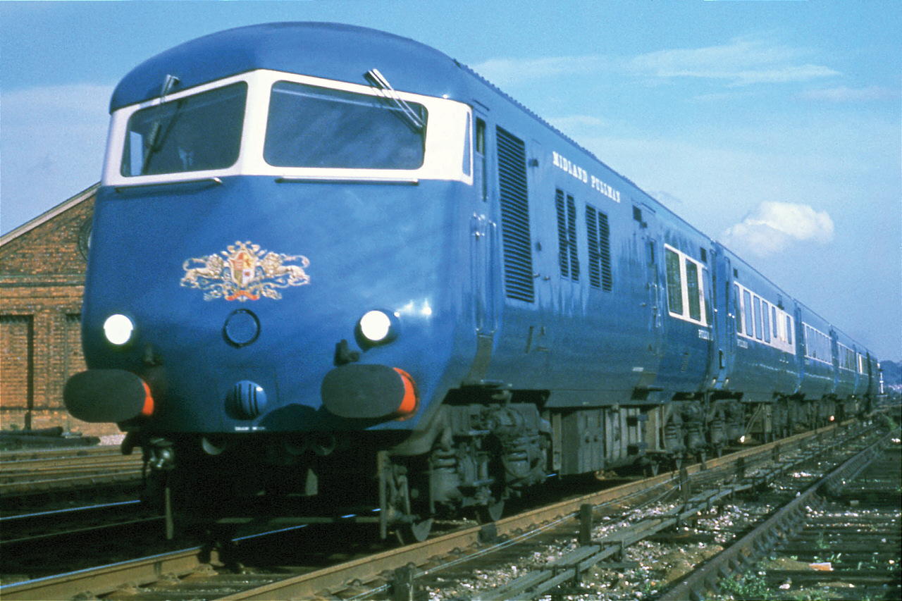
As well as the overall shape of the train, including the instantly recognisable twin windowed front nose, Bill told me he designed the round cornered windows (versions of which are still used to this day), the little table lights, the adjustable seats (“borrowed” from a Russian train) the galley kitchen, the overhead parcel racks (“borrowed” from a VC10) a non touch lavatory flush system and all the door ironmongery. He also designed the individual inlaid timber panels at the end of each carriage, one of which can just about be seen on the above video at about 13 seconds, and another at the top of the image below…

When I asked how as an artist, he had managed to interpret and ensure compliance with all the design briefs, H&S standards and rules that I assumed must surely play a part in designing something as serious and potentially lethal as a diesel-electric train, Bill just said “No, we didn’t bother with any of that business, they just wanted something that looked good and wanted it quickly…”
If only it were that simple today…
Concrete Frieze, Rochester Row, SW1 : Definitely a William Mitchell…
My good friend the artist Bill Mitchell was contacted recently by yet another of the growing band of admirers of his work. An email arrived from someone who works near Emanuel House on Rochester Row, SW10 and who had in passing it regularly, come to love the work. Spanning the entire front elevation of Emanuel House is a narrow, but perfectly formed concrete frieze, which undoubtedly has the tell tale style of a Mitchell…

The reason the admirer made contact however, was to try and ascertain who the originator of the work was. As with much of Bill’s work, online references are few and far between and those that can be found are not always correct. As indeed was the case with this piece, which according to the email, was attributed to someone else even in “official” records.
Bill and his wife Joy have asked if there was anything I could do to help, and so in my own small way, by posting this here, I’m hoping to set the records straight for anyone else who notices and wonders at this little gem of a sculpture and tries to find out more…
In the words of the great man himself…
“This was the first integral piece of concrete art ever produced. It’s a ‘ring beam’ which linked all the columns and on which the remainder of the structure depended. I designed it, made the moulds and the builder poured the concrete.

When I recall all the rows with structural engineers, and architects, plus the criticism from the art establishments of the time (including the Art’s Council) and the broadsides from the press – it was apparently obvious to everyone except me, why this work shouldn’t be made. Afterwards of course once it was finished, everyone agreed that it was the right thing to do, giving interest to this and many other, bleak concrete buildings thereafter, both through my own work and via the many copies.
Now I understand that the ring beam at Victoria has been attributed to someone else. This is astonishing, my work at Emanuel House was a piece of history and because of it many art critics made their names and fortunes whilst I and the builder lost money.

I continued to produce public works of art and now and then when I find that some of my works have been attributed to other artists, it only serves to illustrate for me the philosophy of the time, that ‘art’ should only be in frames, and hung on the walls of London West End galleries…”
![]()
(Apologies for the images, they’re screen grabs cobbled together this afternoon from Google street view.. I’ll update the post once I’ve been and seen the work for myself…)
Star Wars Record Sleeves
This has probably been a thing for some time now, but surprisingly its only just caught my eye…
Doesn’t need much explanation. Instantly recognisable classic album sleeves re-imagined with instantly recognisable characters from Star Wars….
What a genius idea…..


The Kensington Air Terminal…
My And is currently reading a Miss Marple novel, one of the last ones that Agatha Christie wrote I think. Entitled At Bertram’s Hotel, it was published in the mid 1960’s and tells the tale of the now elderly (was she ever anything else…) detective’s stay in a swish London hotel, and the usual fatalities that seem to follow the redoubtable detective like a bad smell…
 I digress. The reason for this post is that in the story, reference is made to The Kensington Air Terminal… Intrigued, And went off to the internet to investigate and sure enough such a thing actually existed, moreover, it would seem that it is now almost totally forgotten..
Situated overlooking the Cromwell Road, on the site of what has been a Sainsbury’s since the 1980’s, and almost equidistant between The Albert Hall and Earls Court, was a group of buildings that together formed a direct link between Heathrow Airport and the city.
Before the rail link was completed in 1977, getting to Heathrow could be a time consuming business by all accounts. BEA (British European Airways) hit upon the idea of creating a central hub where travelers could check in and relax before being transported along with their baggage by luxury coaches to the airport proper, making good use of the recently opened M4 motorway.


Cut away illustration of temporary terminal from The Illustrated London News
The first temporary two storey building (above) was completed in 1957 and proved so successful that a more permanent solution was soon being planned. Designed by Burnett, Tait & Partners, this new facility included additional parking (via some impressive circular access ramps) restaurants and retail opportunities, airport style waiting areas and departure gates, along with a residential tower above. It was finally opened in the early/ mid 1960’s to great fanfare and excitement…


Sadly due to increasing security regulations, land prices and airline takeovers, the building was only in operation for around 15 years or so before being redeveloped by Sainsbury’s.
There is very little online about this intriguing building. The excellent post at The Library Time Machine by Dave Walker is where I found all of the images and much of the info.


How the building (now known as Point West) Looks today
Expo in The Manchester Modernist: Video review
Writing the last post on Expo ’58 has reminded me that I didn’t post my regular outburst of shameless self publicity by informing you that those lovely people at the ever excellent Manchester Modernist have once again been good enough to include one of my offerings in the current issue of their redesigned and relaunched magazine…
A relaunch that was possibly thanks to the unqualified success of its recent crowd funding campaign. So a huge thanks to everyone who contributed in whatever form…
But don’t just take my word for how good the magazine is… Why not watch this very complementary video review by Stack…
And just in case you missed it.. mine was the piece towards the front all about Basil Spence’s stylish British Pavilion at one of the most successful of all such Twentieth Century events, Montreal’s Expo 67. This piece was a reworked and greatly expanded version of an original post here… (which also had lots of photos)

Copies of the magazine are available to buy either singly or via annual subscription here…
Object of the Day… Whitefriars Concentric TV Vase
The first in an occasional series of posts with a single image and a short explanation…

This beautiful grey vase was designed by Geoffrey Baxter and first manufactured in the last 1960s by Whitefriars Glass. Known as the concentric TV vase, it stands about 18cm/ 7″ high and weighs considerably more than you would think it might.
Baxter’s technique for producing the textured surfaces of his pieces derived from the timber moulds he made in his spare time, moulds he lined with anything he thought would make in interesting finish including bark, old nails and wire.
Unfortunately due primarily to the downturn of the mid/ late 1970’s, Whitefriars closed its doors in the 1980’s but it’s generally accepted that the final 20 years or so of the company’s existence was almost solely down to the designs of Geoffrey Baxter.
A huge thanks to R&S for rescuing this wonderful thing from the shop (and then deciding to give it to me…)
Neville Brody & England’s Brazil 2014 shirt…
 I’ll be straight with you. I generally find football, footballers and all things football related tedious in the extreme. Overrated, overpaid and overexposed, it’s a sport whose histrionics, tribalism and small mindedness, have always left me cold…
Until now that is, and the news that the great Neville Brody, easily one of this countries finest graphic designers, has recently unveiled his new typeface for the names and numbers on the back of the new England shirt, to be worn at the Brazil 2014 World Cup.
Invited by Nike to develop the new typeface, Brody described his inspiration as the “focus on the intersection between flair and workmanlike reliability,” and additionally that “The industrialised suggestion of a stencil was simultaneously based on a pinstripe motif, combining style with no-frills efficiency.”
Not exactly sure about all that, but I do like the typeface. It’s clean, legible, contemporary and although you can’t see the pin stripe within the lettering on this image, it definitely adds something to the whole, with the white woven into the blue…
Apparently the design for the shirt itself took inspiration from the 1970 kit, and from the armour of the Medieval Knights… As I said, I know little about it, but I’m guessing that we’ll need more than armour to stand any chance of getting out of the first round (or whatever…)
There’s actually a bit of an outcry here in the UK press about the cost of these new shirts at the moment, and without doubt £90 for a synthetic tee shirt is pretty steep. As such, I suspect I will be in a very, very small minority of people who are now considering buying one because of the pedigree of the typeface on the back, rather than the ego of the player inside…
The Increasing Value of the Coins in your Pocket…
Next time you’re looking through your small change, keep an eye out for the following UK commemorative coins. If you find any of them, you could be in for a pleasant surprise (especially if you bang it up on eBay…)
 The one that’s in the news at the moment is the Kew Gardens 50p. Issued in 2009 and limited to a mintage of only around 200,000 (anywhere between 3 and 11 million is a more usual mintage for commemorative 50p’s) this rare coin is currently changing hands for around £200
But there are others that are worth looking out for…
The 2008, 20p coin. When the Royal Mint redesigned the definitive UK set of coins (i.e. the ones you see every day) in 2008, the new design had the date on the Obverse side (the Queens head side).
 The old design however had the date on the reverse side. For reasons that are unclear, there was a mismatch of the dies/ stamps used to make the new coins when it was first minted and the old obverse (Queen’s Head) was used on the new reverse (the lions back legs). It’s the middle combination of the three versions to the right.
Confusing perhaps, but the upshot is simple: there are somewhere between 50,000 and 200,000 20p coins with no date on them… Find one of those and you could be £100 better off.
 Then there is the Swimming Olympic Games 50p. The initial design had the swimmers face much more obscured by water than the reworked final version. Around 600 of these first coins were issued and if you’ve got one, they are currently worth around £3000.
Finally we have a lettering mistake. In 2005, a £2 coin was issued to mark the 400th anniversary of Guy Fawkes and the gun powder plot. It seems the dies used to stamp the inscription around the edge were not 100% accurate resulting in the words “Pemember Pemember The 5th of November” appearing rather than the more familiar phrase… These are only worth about £20, but it’d still be a nice thing to find…

And in case you’ve ever wondered why the edge inscription on the £2 coin sometimes reads correctly with the reverse side up and sometimes with the obverse side up, it’s simply because the inscription is rolled into the edge of the blank disk before the two faces are stamped, and the blank is allowed to fall into the coin press as it will…
Lazy Post No. 11 – The Door Reimagined…
Designed by the Austrian artist, Klemens Torggler, I’m tempted to just post the video up of the man himself demonstrating his revolutionary door concept and leaving it at that. The action of it closing is just beautiful…
Quick couple of thoughts though… How effective would it be at keeping noise out and how long will the folds in the rubber/ plastic material last…
Still I like it very much as an idea. Very elegant. There are other earlier iterations of his door concepts, all of which are very intriguing in their own way, especially this one based on an epitrochoid curve…

Sochi Medals and Russian Meteorites…
 The medals that have been designed for this years Winter at Olympics at Sochi are looking pretty sharp…
In keeping with the entire Winter Olympic theme, the design is centered around the idea of the contrasts that embody Russia: Europe meeting Asia, pristine nature set against huge cities, and innovation alongside its rich cultural heritage.
The usual metals of bronze, silver and gold, have been embellished with a rather stylish glass element, through which “the sun’s golden rays are deflected as through a prism of snowy mountain tops, the warm sea and frosty ice living side-by-side.” The glass has been engraved with the patchwork quilt design seen throughout the games, and which represents the “mosaic of national designs from the various cultures and ethnicities of the Russian Federation.”
 All very nice…
Another aspect of the Sochi Medals that intrigues me, is that the 7 gold medal winners scheduled for Saturday 15th February, will all receive an additional gold medal, embedded into which is a small piece of the meteorite that landed near the Russian city of Chelyabinsk on that exact day last year.
You may remember seeing videos and images of the meteorite as it made its fiery way across the Russian skies before exploding with a power greater than 20 atomic bombs and smashing into the Russian landscape, causing widespread injury and damage.

The shards for the Olympic medals have been taken from the largest chunk that landed in Chebarkul Lake, deep in the Ural Mountains, and which was finally retrieved after a three week long operation, weighing in at 650kg (before it was sadly dropped and split into 3 pieces…)
Which, after reading the reports this weekend about courses and tracks being too short or too long (an believable 750m too long in the case of the 15km Ladies Skiathlon according to one BBC commentator) hotels rooms being neither ready nor habitable and technical problems at the opening ceremony, may have been an early indication of things to come…


